Wednesday, February 28, 2018

Xiaomi Redmi Note 5 Pro vs. Mi A1: MIUI takes on Android One

The Redmi Note 5 Pro and Mi A1 are wildly different in what they bring to the table, but they're both great at offering incredible value for money.

Xiaomi surged up the ranks in India last year on the back of a flurry of launches in the budget segment. The first in that wave of devices was the Mi A1, which is unlike any other Xiaomi device previously released. Instead of the standard MIUI, Xiaomi teamed up with Google to bring Android One to the device, resulting in a device with a gorgeous metallic design paired with pure Android.

The Chinese manufacturer hasn't divulged Mi A1 sales figures, so we don't really know how many units have made their way to end-users. But if one infamous poll is to be believed, there's considerable interest in Android One over MIUI, at least for a subset of Xiaomi customers.

For its part, the Mi A1 was one of the best — if not the best — budget phone of 2017, thanks to its design, software experience, and blazing-fast performance. With the Redmi Note 5 Pro looking like a strong contender for the best budget phone of 2018, it's time to see how the Mi A1 has fared over the last six months and if it's a worthy challenger to Xiaomi's latest budget phone.

Xiaomi Redmi Note 5 Pro vs. Mi A1: Specs

Category Redmi Note 5 Pro Mi A1
Operating System MIUI 9.2 based on Android 7.1.1 Nougat Android 8.0 Oreo
Display 5.99-inch 18:9 FHD+ (2160x1080) IPS LCD panel
403ppi pixel density
450nits maximum brightness
5.5-inch 1080p (1920x1080) IPS LCD panel
401ppi pixel density
SoC Octa-core Qualcomm Snapdragon 636
Eight Kryo 260 cores up to 1.8GHz
14nm
Octa-core Qualcomm Snapdragon 625
Eight Cortex A53 cores at 2.0GHz
14nm
GPU Adreno 509 Adreno 506
RAM 4GB/6GB 4GB
Storage 64GB/64GB
microSD slot up to 128GB
64GB
microSD slot up to 128GB
Rear camera 12MP with 1.25um pixel size and f/2.2 lens + 5MP with 1.12um pixel size and f/2.0 lens
PDAF, LED flash
1080p video recording
12MP with f/2.2, 1.25um pixels + 12MP telephoto f/2.6 and 1.1um pixels
Dual-tone flash, PDAF
4K@30fps
Front shooter 20MP with LED Selfie light
1080p video recording
Beautify 4.0
5MP with f/2.0 lens
1080p video recording
Connectivity LTE with VoLTE
Wi-Fi 802.11 ac, Bluetooth 5.0, GPS, GLONASS
Micro-USB, 3.5mm audio jack, IR blaster
LTE with VoLTE
Wi-Fi 802.11 ac, Bluetooth 4.2, GPS, GLONASS
USB-C, IR blaster, 3.5mm jack
Networks LTE: 1/3/5/40/41 LTE: 1/3/5/7/8/20/38/40
Battery 4000mAh battery
5V/2A over MicroUSB
3080mAh battery
5V/2A over USB-C
Fingerprint Rear fingerprint sensor Rear fingerprint sensor
Dimensions 158.6 × 75.4 × 8.05mm 155.4 x 75.8 x 7.3mm
Weight 181g 165g
Colors Gold, Rose Gold, Blue, Black Black, Gold, Rose Gold, Red

Where both are evenly matched

From the very beginning, Xiaomi's focus on build quality allowed it to stand out in the budget segment. At a time when the category was rife with plasticky phones with shoddy construction and materials that flexed under pressure, Xiaomi introduced all-metal designs with an alluring design and outstanding build quality.

That reliance on quality paid off handsomely for the brand, and with the Redmi Note 5 Pro, Xiaomi is introducing even more rigorous quality control to minimize hardware defects. Sure, the Redmi Note 5 Pro is essentially using the same design language as the two-year-old Redmi Note 3, and while the aesthetic is starting to look stale, it is one of the most well-built phones available in this segment.

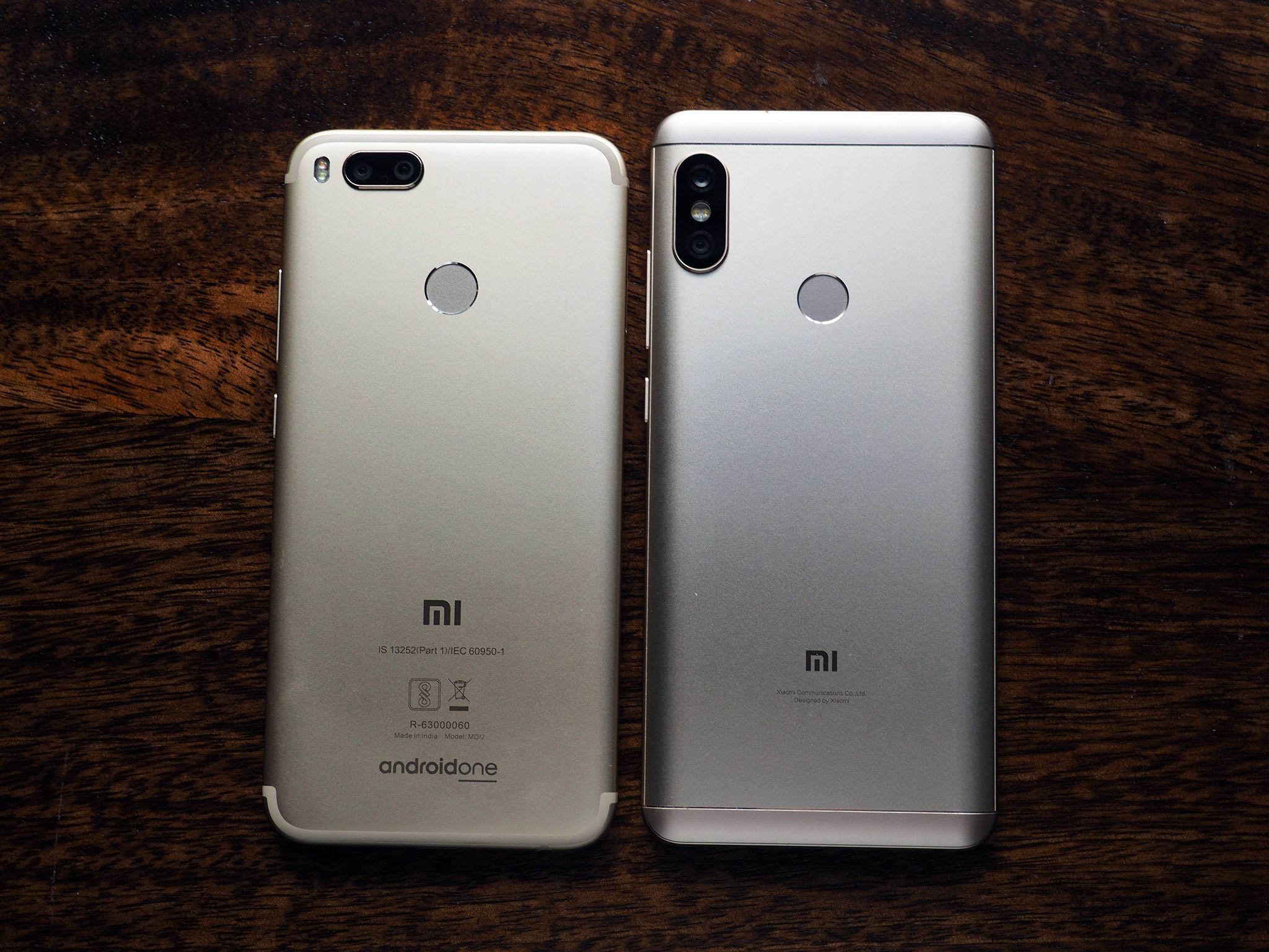
Out of the two, the Mi A1 looks more premium, and that's down to the design at the back. Both phones have been inspired by iPhone designs — the Mi A1 has the antenna lines from the iPhone 7, and the Redmi Note 5 Pro has the same camera arrangement as the iPhone X. But as we're seeing more and more often, if it's a popular design, phone manufacturers are going to steal the idea.

Both the Redmi Note 5 Pro and the Mi A1 have dual cameras at the back, but the former has the sensors arranged vertically whereas the latter features a horizontal configuration. Although both devices have dual cameras, the secondary sensor plays different roles in each — the Mi A1 has a telephoto lens and the Redmi Note 5 Pro features a depth-sensing module.

Xiaomi is one of the few manufacturers to offer IR blasters across its range of devices, and both the Redmi Note 5 Pro and the Mi A1 feature the module at the top of the phone.

What the Redmi Note 5 Pro does better

The major design change with the Redmi Note 5 Pro is the switch to an 18:9 5.99-inch panel. Xiaomi is starting to offer taller displays in the budget segment with the Redmi Note 5 series, and the design itself isn't quite as bezel-less as the Mi Mix 2, and more in line with what we've seen on the Pixel 2 XL instead.

The taller size and reduced bezels means you get more screen real estate in roughly the same size as the 5.5-inch Mi A1. And although the Redmi Note 5 Pro has an 18:9 panel, the quality of the display itself is the same on both devices. Viewing angles are great, as are contrast levels and sunlight legibility.

An added bonus with the switch to the 18:9 form factor is the removal of the hardware navigation buttons, with Xiaomi now offering on-screen keys instead. The move makes it possible to switch the configuration of the back and overview buttons on the Redmi Note 5 Pro. The Mi A1, on the other hand, relies on hardware nav keys, with the back button located to the left of the home button and the recents key on the right.

The Redmi Note 5 Pro also wins out on the hardware front. Xiaomi switched to the 14nm Snapdragon 625 last year, choosing energy efficiency over sheer performance, and as a result there was a decline in power from the 28nm Snapdragon 650. The downturn was noticed mostly when playing visually-intensive games, with the Snapdragon 625 more than able to meet everyday usage tasks.

The Redmi Note 5 Pro sets a new benchmark for the budget segment.

With the Redmi Note 5 Pro, that's changing again. The phone sees the global debut of the Snapdragon 636 platform, which brings Qualcomm's semi-custom Kryo cores to the budget category. The Kryo cores used in the Snapdragon 636 are based on ARM's A73 core, which is one of the fastest performance cores on the market today.

The Redmi Note 5 Pro is the spiritual successor to the Redmi Note 3, and unlike last year, you're getting great performance as well as long-lasting battery life. Honestly, the Redmi Note 5 Pro sets a new benchmark for the budget segment in terms of performance.

Then there's the battery side of things. The Mi A1 delivers astonishingly great battery life even though its battery size at 3080mAh isn't quite as large as what you get on the Redmi Note phones, but it doesn't come close to the Redmi Note 5 Pro. Like last year's Redmi Note 4, the Redmi Note 5 Pro is a battery monster, delivering at least two days' worth of usage from its 4000mAh battery.

One of the major new features in the Redmi Note 5 Pro is the camera, and while the Mi A1 had one of the better cameras in the budget segment last year, it's not as good as what Xiaomi has managed to achieve this year.

Xiaomi Redmi Note 5 Pro on the left, Mi A1 on the right.

The Redmi Note 5 Pro consistently takes better pictures, both in daylight as well as low-light conditions. It's under artificial or low lighting where the camera truly shines, as this was the one area where budget phones traditionally struggled. Even shots taken in daylight have much more detail and dynamic range on the Redmi Note 5 Pro.

Where the Mi A1 wins

There's no doubt that Xiaomi makes great hardware; but as good as the hardware is, the software side of things haven't evolved quite as much over the years. That was why the Mi A1 was a welcome move. The phone offers the best of both worlds — you get Xiaomi's gorgeous design and build quality, coupled with pure Android and the guarantee of fast updates.

Sure, Xiaomi put a lot of effort into customizing MIUI for the Indian market, and there are a few features in the ROM that would've been a great addition to Android One. The dialer in pure Android, for instance, is barebones to say the least, as is Android Messages. At least when it comes to stock apps, Xiaomi does a much better job.

The Mi A1 demolishes the Redmi Note 5 Pro when it comes to software.

That said, MIUI is no match for Android One when it comes to the design aesthetic. MIUI over the years has ballooned into a ROM that's laden down with features, and while Xiaomi introduced much-needed optimizations in MIUI 9, we're long overdue a complete visual redesign.

The Mi A1 picked up the Oreo update at the start of the year, and Xiaomi is doing a decent job when it comes to rolling out security updates. In this area, it's a no-contest — the Android One-based Mi A1 absolutely muscles the Redmi Note 5 Pro when it comes to the software experience.

Which should you buy? Your call

At the end of the day, Xiaomi is in a win-win situation here — for the longest time, it's fans have been clamoring for a device with pure Android, and it has delivered just that in the Mi A1. The phone is ideal for those looking for an uncluttered software experience, and it has the best bits of MIUI thrown in for good measure in the Mi Camera as well as the Mi Remote app.

The Redmi Note 5 Pro, meanwhile, showcases the best that Xiaomi has to offer in the budget segment. There's no outright winner here, as both phones offer incredible value for money. If a clean software experience is what you're after, then the Mi A1 is ideal for you. If you want a phone with the best hardware available today and a class-leading camera, then the Redmi Note 5 Pro is the obvious choice.

If I had to choose, I'd go with the Mi A1 simply because it delivers the best software experience in this segment, and it's guaranteed to be one of the first phones to receive platform and security updates. That said, I do like the Redmi Note 5 Pro's camera better, and the hardware on offer with the device is just staggering. An Android One variant of the Redmi Note 5 Pro would be the perfect device for this segment.

Simply put, these are two of the best budget phones available today.

The Redmi Note 5 Pro also comes with an 18:9 panel with configurable on-screen navigation keys, and the variant with 6GB of RAM and 64GB of storage should be more than adequate for even the most hardcore users. Then there's the dual camera at the back, which has the potential to be one of the best in this segment for a long time. The front 20MP camera is no slouch either, and if you're one to take a lot of selfies, there's Beautify 4.0 and a software-assisted portrait mode.

Sure, MIUI is in need of a visual overhaul, but Xiaomi at least optimized the ROM in MIUI 9, and things aren't as slow as they used to be. The upside with the Redmi Note 5 Pro is the sheer performance on offer, and it's unlikely we'll see a phone come close to matching that in this category anytime soon. The fact that it costs the same as the Mi A1 at ₹13,999 is a masterstroke.

If you're looking for even more grunt, then the 6GB version of the Redmi Note 5 Pro is all set to make its debut in the country shortly.

See at Flipkart


from Android Central - Android Forums, News, Reviews, Help and Android Wallpapers http://ift.tt/2F2rLp5
via IFTTT

Moss for PlayStation VR Review: The first chapter in a truly epic story

The hype is real. This is exactly the kind of experience VR exists to deliver. But I'm going to need a lot more of it.

Imagine for a moment you are a giant spirit, your sheer mass allowing you to gaze down upon the world as though we humans were all living in dollhouses. You have the ability to interfere with our lives in small ways, but your primary task in life is to observe the story that is our existence.

That, in a nutshell, is the new PlayStation VR game Moss. You more or less observe story of Quill, a brave little mouse who is called to greatness. She's got destiny on her side and you as the hovering spirit to help her out from time to time, and what you experience in this game is the first part of her story.

See at Amazon

Listen, learn, and fight!

Moss story and art

Moss is more or less a side-scrolling adventure brought to Virtual Reality, presented as though you are journeying through pages in a book. The game is broken up into sections you can observe by sitting still, looking from left to right. Quill starts on one side of the screen, and you help her get to the other side. The representation isn't always left to right, but that is certainly the default. As you complete a section, you hear a page turn and the world around you changes to the next part of the scene. Rinse, repeat.

What makes each section interesting are the puzzles. Quill needs to navigate the world from the perspective of a small mouse, while you observe and help with advantages like seeing through walls and being able to stand up to see the whole area. You can peer around corners Quill cannot, and together you unlock doors and set traps and fight. Neither of you are able to do this alone, but together the puzzles are a lot of fun to play through. The ability to stand up and look around a world is incredible, and on more than one occasion gave me the unique perspective I needed to quickly solve a puzzle and move on with the story.

This is also the real opportunity to take in the art of the game. Moss is built in such a way that Quill sees everything as fairly simple and either dark or colorful through most of the game, but with your superior vantage you see a world utterly destroyed by a massive war interrupted by stunning moments of untouched simplicity and beauty.

Moss is a shining example of what makes VR gaming so special.

When I say you observe Quill, I'm being a little obtuse. You still very much control Quill with your DualShock controller, with buttons for attack and jump to generally navigate her around. But when you get to a puzzle, she uses a combination of squeaks and American Sign Language and gestures to show you how to solve the puzzle. You as the giant spirit interact with her as an equal, giving her high fives and waving to her when she waves at you, but when it comes to jumping off cliffs and fighting monsters it is very much you in control of the mouse. This split focus is a lot of fun, because you can multitask quite effectively. Your abilities are mostly limited to healing Quill and lifting heavy things when they need lifting when it comes to physically influencing the world, but by being able to see everything from your mighty vantage you can better guide Quill as you see fit.

In fact, by basically using your face as the camera angle for the third-person Quill experience in Moss, it often becomes easy to find flaws in the world this game is built on. Areas the developers have arbitrarily stopped you from climbing on or jumping through because it doesn't suit the puzzle, but as the viewer you can clearly see Quill could easily step through a hole in the wall or climb a wall a different way. Like many games, Moss adds a splash of color to areas it wants you to climb instead of leaving it to the player to discover and making the experience a little more open. It's an unfortunate bit of user agency restriction in an otherwise fantastic environment.

Don't get distracted, no matter what

Moss gameplay

Most third-person hack and slash games, of which Moss very much is, features a hero that can take a couple of hits. Quill is not that kind of character, and that introduces an amazing level of difficulty you don't frequently experience in this genre. Most of the enemies in this game can seriously damage Quill with a single hit, and as you progress in the store there are several enemies capable of dispatching her with single strikes. Success in these fights relies on Quill's speed, and your ability to interrupt certain attacks as the giant spirit while also counterattacking as Quill. It's remarkable how challenging that concept can become when there are multiple enemies in play, because the natural instinct from years of gamplay is to focus on what Quill is doing in a fight. In fact, if you don't lean back a little and observe the entire arena for combat, Quill is likely to be in a lot more trouble.

Moss is also uniquely challenging in its hidden puzzles. Nearly every section of the game has a hidden scroll for Quill to find, so much so that coming across an area without a scroll can occasionally feel like a failure on your part. These scrolls often require additional planning in a puzzle so you don't have to start over, or standing up and looking around the map to see areas Quill cannot. This whole aspect of the game invites a level of interaction you can't get outside of this environment. In this respect, Moss is a shining example of what makes VR gaming so special.

The story itself is very linear, right down to the level of interaction in your gameplay. Everything starts off very casual, but by the end of this part of the story you are at the edge of your seat rushing Quill from section to section to see what happens next. The enemies become increasingly more challenging, the puzzles start to grow beyond individual sections of the story, and eventually you are in a full sprint to the end of the tale. It's the kind of experience you can thoroughly enjoy in a single sitting because it sucks you in, but also because the story itself isn't particularly long.

I completed my first run through Moss in a little over three hours to see how the story ended. I missed quite a bit, and plan to go back and fully explore the game from beginning to end, but either way you look at it this is not a long game. The ending makes it very clear this is the first part of a story, which implies there will be more to play at some point in the future.

Should you buy it? Absolutely

I loved every minute of this game. There are a few small things I would change, starting with Polyarc's decision to start every chapter with a blinding flash of white light directly into my eyeholes, but it's a small criticism in what was otherwise an exceptional story. There can be no greater sign of a quality experience than getting to the end and wanting more, and Moss delivers that without making you feel like you've been shortchanged.

If you own a PlayStation VR, spend the $30 and take a trip through Moss. You will not regret it.

See at Amazon

Pros:

  • Incredible scale and immersion
  • Beautiful environments
  • Challenging puzzles

Cons:

  • Physically painful flashes of white light
  • Little user agency
  • Game can be beaten in three hours

Outstanding

4.5/5


from Android Central - Android Forums, News, Reviews, Help and Android Wallpapers http://ift.tt/2oDoXDI
via IFTTT

LG G7 makes an appearance at MWC 2018 along with V35, new watch, and more

LG's could-have-been flagship for 2018.

LG's appearance at this year's MWC was, timid, to say the least.

The company's new LG V30S is essentially just a spec bump over the regular V30 with a couple small software tweaks, but apparently, LG had more exciting things to show off behind closed doors.

According to Ynet, LG had a working unit of the G7 (codenamed "Neo") to show off to select attendees of the trade show. This is the G7 that LG's new mobile head scrapped in favor of the new "Judy", but nevertheless, it gives us an idea of what we could see with that phone when it's released this June.

As you can see from the above photos, the G7 follows the steps of other Android OEMs by adopting the iPhone X's notch with its screen. However, LG built a software trick around this to give users the option of hiding it with a black status bar. As for the screen surrounding that notch, it's reportedly a 6-inch, 19.5:9 panel with a resolution of 3120 x 1440.

Qualcomm's Snapdragon 845 powers the phone, there's 64GB of internal storage, and two different models with 4 and 6GB of RAM.

On the back of the G7 is a glass back (this particular model features a blue color), fingerprint sensor, and two cameras that are positioned in a vertical fashion.

Shortly after this news came out, Evan Blass also gave us this little nugget:

We don't have any images of the above gadgets, but I'm really curious to see what comes of this mystery smartwatch. LG's last wearables were the Watch Style and Watch Sport, and while they were supposed to lead the Android Wear 2.0 charge, each one had too many quirks to be truly great.

Assuming LG's Judy has any resemblance to the G7 Neo, are you looking forward to what we see from LG later this year?

LG V30S hands-on: A 2017 smartphone with 2018's buzzwords


from Android Central - Android Forums, News, Reviews, Help and Android Wallpapers http://ift.tt/2owisn2
via IFTTT

First five things you need to know about Moss for PlayStation VR

Meet Quill, the bravest, strongest mouse ever.

Since we first saw Moss at E3 last year we have been waiting with baited breath for it to arrive, and it finally has! Released on February 27th, it has already stolen our hearts and fills our hours with the beauty of a fully realized world.

Lets take a look at some of the top tips to make your journey through the land of Moss even better.

See at Amazon

You are not Quill

Though you control the actions of our little mouse adventurer, you do not actually play the game as her. You are a spirit, or as the game calls you the Reader, who is the companion of Quill and you have your own function to perform above and beyond just moving Quill.

Using the Sixaxis Controller you can pick up and move objects in the game. A lot of the time this means moving statues and pieces of puzzles to help Quill traverse the environment but other times it gets more complicated. Using your control you can pick up enemies to stop Quill from being overrun, or even more fun you can move enemies to help you open doors or activate switches where otherwise you wouldn't be able to.

This level of cooperation and interaction is rare in any game so it is doubly exciting when you are in VR and playing it so close. It makes you think not just about what needs to be done to solve the puzzles but how you can achieve that goal using all the environment, not just turning a dial here or flipping a switch there.

Look Behind things

Moss has a set of scrolls to collect as part of the main story and they are hidden in some unusual places that you may need to move around to find. When playing the game you can get lost in the story and with watching Quill and you start to forget, at first, that you are in VR, until the first time you look around a column. When it happened to me I was trying to get a better look at some of the scenery and as I tilted my head I saw one of the scrolls behind the wall on the far side, easy enough for Quill to reach but had I been playing the game in the traditional way I would never have seen it.

Puzzles can be solved in the same way. By looking around obstacles or into smaller areas you can often see things you would notice normally and the change in perspective makes it much easier to solve the puzzles that, if you were on a fixed camera, would be much harder. Being able to look at the whole map and even lean in closer to the action has the added benefit of being able to appreciate the art that goes into a game like moss. Quill is a perfectly rendered little creature that feels alive, especially when you can lean down and see her ears and nose twitching randomly as she sits and waits for you. Speaking of waiting..

Quill is occasionally smarter than you

When you start playing the game the puzzles are simple enough, pull this lever, move this statue, that kind of thing but as you start to progress things become more challenging. The puzzles start to have multiple components that you need to do at the same time to get them to work and sometimes, after an hour or two of playing your mind just can't piece it all together. Thankfully you are part of a team in Moss and not just on your own. It turns out the little mouse adventurer that is your partner in this game is far cleverer than you. She knows how to do it.

If you are struggling to figure out what to do with a certain puzzle just wait for a minute and look at Quill. Eventually, she will get impatient and start showing you, using American Sign Language, how to complete it. Honestly, I enjoy waiting to see what she says anyway because the animations are so fluid and well done. Most of the time she gives you that last little piece that's missing, like telling you to turn the stairs or make the bug shoot, which makes your brain turn on and you can start figuring. It doesn't always help mind you, and she won't tell you how to get the scrolls that are hidden on the levels, but invariably she can point you in the right direction.

More: Everything you need to know about Moss, the most anticipated PlayStation VR game of 2018

You can hold things and move Quill

A lot of the game puzzles in Moss require you, the reader, to move objects in the world using your Sixaxis Controller. They make this action as interesting as possible by making the variety of things you need to move, well, varied. From statues to gears and cogs there is a long list of things you can do to help Quill get through the maze including using the enemies that appear too. Using enemies is extremely helpful as they can be moved to stand on plates that Quill can't reach.

What makes Moss almost unique in puzzle games is that you can move yourself and Quill at the same time. By holding an enemy in place while moving moss to another area you can solve puzzles that normally wouldn't work, or use this skill in combat to make a huge difference. You can use your hold maneuver to drag enemies away from Quill while she fights another enemy, stopping her from getting overrun, it's very satisfying and adds a layer of complexity to Moss that elevates the whole game.

You can use enemies to kill other enemies

This is a really helpful tip for combat. Quill is very brave but a little squishy, it only takes two or three hits to knock her out and restart the level so you need to use all the dirty tricks you can. You can use several enemies in the game when you have them in your Sixaxis grip to fire, or explode parts of the landscape to help solve puzzles, happily they can also kill each other using that power too.

When you are in combat with multiple enemies keep your eyes peeled for the ones that fire or explode and use that ability to keep Quill out of combat. I managed to complete a big fight by hanging Quill on a ledge and using the shooting beetle to kill all the little guys, then Quill finishes off the one I was controlling. Keeping your little mouse friend alive is really your only task as the "reader" so you may as well use the forces of evil against themselves.

This is just the beginning

These five tips are really just the start of what you can do in Moss but they will help you get started in fine fashion. navigating this world with Quill really does feel like a partnership so you learn together how best to succeed. Let us know in the comments if you find any other cool tips for your fellow readers.


from Android Central - Android Forums, News, Reviews, Help and Android Wallpapers http://ift.tt/2sZXVfq
via IFTTT

The head of Alexa AI is now working at Google

Ashwin Ram is now Google Cloud's Technical Director of AI.

Amazon's got a lot of people working on Alexa at any given moment, but one of its top employees has officially left for a position at Google. According to a LinkedIn post, Alexa AI's head of research – Ashwin Ram – is Google Cloud's new Technical Director of AI.

Per Ram's post:

Excited to share that I'm joining Google Cloud as Technical Director of AI in the Office of the CTO. Google arguably has the best AI on the planet; my role will be to help make that AI even better and broadly available to everyone.

I've had an awesome couple of years at Amazon Alexa working with some of the smartest people I know. Delighted to have had the opportunity to create and lead Alexa Prize and to experience this legendary Day 1 company from the inside.

Although Google Cloud isn't a consumer-facing product, it does power various aspects of services like YouTube and Google Search. Amazon hasn't announced who will be replacing Ram's position, but either way, this is a pretty solid win for Google in its quest to be the best at AI.

Shortly before Ram's departure, it was announced that Amazon had purchased smart doorbell/floodlight maker Ring — just a couple months after it purchased Ring competitor Blink. Amazon's hitting the connected-world with full force, and while Ram's absence won't necessarily help the company, it certainly won't stop it from chugging along with everything it's got.

The Best Alexa-Compatible Smart Devices


from Android Central - Android Forums, News, Reviews, Help and Android Wallpapers http://ift.tt/2FFzBlD
via IFTTT

These Android phones support wireless charging

Does your phone support wireless charging?

Wireless charging has been around for a few years now, but sadly it hasn't become as widely adopted as we'd like. That may change now that Qi and Powermat and the various companies backing them are working together, so keep your fingers crossed.

However, many popular phones are beginning to embrace wireless charging, and if that's something you're looking for in your next phone, here's a list of those lucky devices.

The best wireless charging pads for Galaxy S8

Note: All devices below support Qi charging. Devices marked with a * do not offer support for AirFuel or PMA wireless charging.

  • Samsung Galaxy S9
  • Samsung Galaxy S9+
  • Samsung Galaxy Note 8
  • Samsung Galaxy Note 5 *
  • Samsung Galaxy S8
  • Samsung Galaxy S8+
  • Samsung Galaxy S8 Active
  • Samsung Galaxy S7
  • Samsung Galaxy S7 edge
  • Samsung Galaxy S7 Active
  • LG G6 (U.S. versions) *
  • Moto Z (with Mod) *
  • Moto Z Play (with Mod) *
  • Moto Z2 Force (with Mod) *
  • Moto Z2 Play (with Mod) *
  • Sony Xperia XZ2 *

While wireless charging may not be as fast as a traditional plug, being able to plop your phone on a wireless charging block/stand/mat while at your desk, eating dinner, or sleeping can make a world of difference to the phone and its user.

We'll update this list periodically with new devices that support this wonderful feature.

Update February 2018: Added the newest phones that support wireless charging.

Check out the Qi gear I'm using!


from Android Central - Android Forums, News, Reviews, Help and Android Wallpapers http://ift.tt/2y8hSik
via IFTTT

Twitter adds Bookmarks so you can save tweets for later without liking them

Say goodbye to awkwardly liking tweets you don't actually agree with.

Twitter's my go-to social network of choice, and while I enjoy most parts of it, there are a few areas that are in desperate need of improvement (I'm looking at you, un-editable tweets). While edits still aren't here, Twitter is adding something that a lot of people have been asking for for a while — bookmarks.

As you can probably guess, the purpose of bookmarks is to give you an easy way to save tweets for later that you might not have time to look at right that very second. To do this, tap on the new share icon and then select "Add Tweet to Bookmarks."

To then find any tweets you've bookmarked, just tap on your profile icon and then the Bookmarks tab.

Up until now, the only way to save tweets for later was to like them. This method worked fine, but it meant you had to like tweets for later viewing even if you didn't really like/agree with what they said.

I don't currently have access to Bookmarks on my account, but Twitter says this feature is rolling out today to its Android, iOS, and Lite apps, as well as its mobile site.

This is our first look at Fitbit's next smartwatch


from Android Central - Android Forums, News, Reviews, Help and Android Wallpapers http://ift.tt/2COxI37
via IFTTT