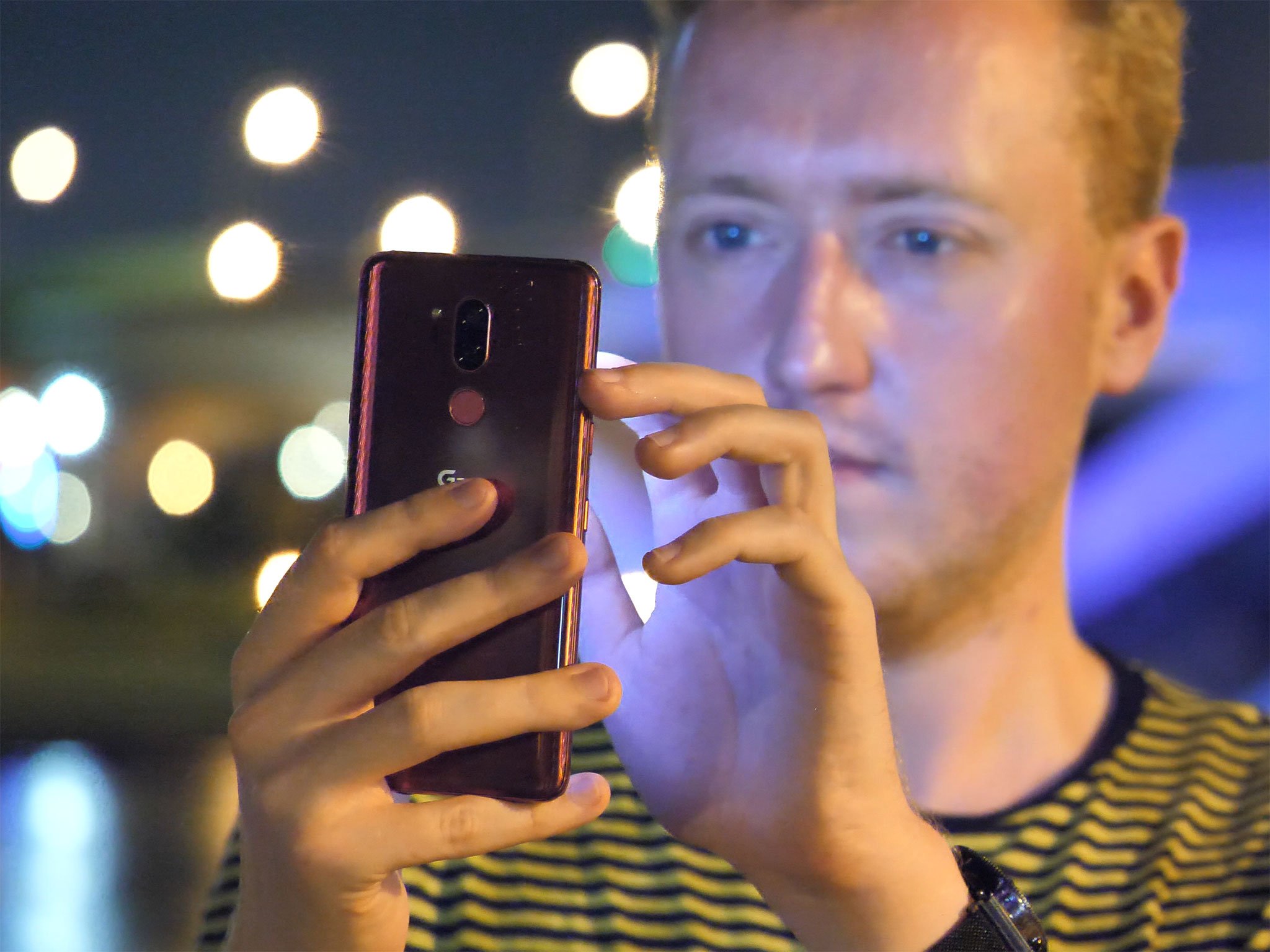
When every phone is big and tall, one-handed mode and other accessibility features should come as standard.
It's the age of big, tall. ridiculous phones, and we need to look again at the usability features that makes these devices easier to wrangle with one hand.
One of the great things about the emergence of 18:9 handsets last year was the ability to cram more inches of screen real estate into a similar device footprint. (Though, sure, direct apples-to-apples comparisons between 16:9 and 18:9 screen sizes can be misleading.) A lot of apps bunch information into rows (think emails in Gmail, or tweets in Twitter), and so a taller phone often gives you better information density. Going tall also lets you expand the screen area without enlarging the part of the phone your hand needs to grip.
But as we've moved towards ever taller aspects like 19:9 and 19.5:9 in phones like the OnePlus 6 and LG G7, we need to demand more from the software. Take the LG G7, for instance. It's not a particularly large phone, fitting into the footprint of a 5.2-inch, 16:9 device, but it is a very tall phone. That means reaching anything around the top of the screen is tricky. And hey, it turns out there's a lot of stuff you need to interact with located around the top of the screen.
Android's notification shade lives up there. Countless apps still use hamburger menus in the top-right corner. Most phones still stick volume controls up there. Reaching up there on a 19:9 device is touch.
Short of completely redesigning Android's system UI, the solution to this is a robust set of usability features. Samsung was first (and initially ridiculed) for its one-handed mode, which shrinks the screen down into a little window, making it easier to reach the top. Others like Huawei, HTC and LG have since gotten on board with their own versions of this feature.
Huawei was first with an ingenious swipe-down gesture on its rear-facing fingerprint scanner, offering a simple gesture to bring down the notification shade at any time, without contorting your thumb up to the top of the screen. Many others, including Google, have followed.
As of Android 9.0, Google's Pixel phones relocate the volume controls to the right-hand-side of the screen, making it easier to fine-tune the volume without reaching the most inaccessible part of the screen.
Many Android phones implement one or two of these features. But often they're not enabled by default, and hidden behind layers of menus. And that's when they're even there to begin with. Bafflingly, neither the LG G7 nor the OnePlus 6 include the swipe-down fingerprint scanner gesture -- even though in OnePlus's case, last year's 5T did offer this feature. LG for what it's worth, does have its own "mini view" feature, but the swipe-in gesture to activate it is frustrating and unreliable.
So if lanky phones are to continue dominating the high end, it's time for phone makers to start including all, not just some of these usability features, and start telegraphing them to phone owners as part of the initial setup. And Google, as platform holder, should be proactive about building some of these into stock Android. Some of that work seems to have already begun in the current Android P beta.
Big, tall phones are great for all the obvious reasons. But the software side needs to catch up to the hardware if we're to dodge the related usability frustrations in the next generation of Android flagships.
Other odds and ends on a working Sunday:
-
I'm surprised by how much I'm enjoying using the LG G7 now that I've got my hands on a final, production device. (Until the past week or so, everyone's been using pre-production G7s.) This phone gets the fundamentals right, sports the best wide-angle camera on any phone, with superior wided and built-in audio, and has excellent haptics and solid battery life. Look for a review in the next few days.
-
That said, this is not a particularly interesting phone for enthusiasts. Look to the V40 later this year for more trailblazing tech.
-
I just can't use a phone with a physical keyboard anymore -- which sucks, because I'm envious of the fun everyone seems to be having with the BlackBerry KEY2. Based on what I'm hearing from Andrew and others, this is a nice little niche phone with a lot of thoughtful new additions, and necessary upgrades for owners of the KEYone.
-
Whatever you think of USB-C audio, you can't argue that the dongle situation on Android phones is a mess, as Jerry details here. It's a minefield of compatibility issues, and makes Bluetooth audio seem tame by comparison.
-
I'm off to Italy with MrMobile and a handful of other journos and 'tubers tomorrow where we'll be seeing what Huawei has in store for us. Follow me, him, and all of us on the socials to follow what we're up to!
-
The Galaxy Note 9 is shaping up to be the most interesting Note in a long time. (Interesting in a good way, not the other kind of interesting.) Looks like the outside of the phone isn't changing much, but important upgrades to the battery and camera could see the Note regaining its status as the big, beefy phone for enthusiasts.
That's it from me, see you on Editor's Desk in a few weeks!
-Alex
from Android Central - Android Forums, News, Reviews, Help and Android Wallpapers https://ift.tt/2lxcMr6
via IFTTT

No comments:
Post a Comment