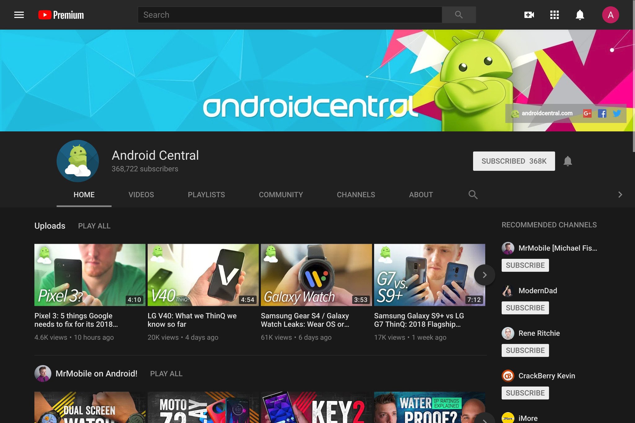
![]() This vision of loveliness brought to you by Substratum and Andromeda, which I should not need to enjoy YouTube in the dark.
This vision of loveliness brought to you by Substratum and Andromeda, which I should not need to enjoy YouTube in the dark.
I just want to binge YouTube in bed without burning my retinas with a sea with white. Is that so much to ask?!
YouTube announced a dark theme for its website way back in May 2017, and it released its dark theme to iOS users back at the beginning of the year. When you go to YouTube's support page for Dark theme, you can see how easy it is to turn it on on Apple devices and on computers, but when you click on the Android tab, you get a slap in the face with "Dark theme is currently only available on IOS. Dark theme on Android is coming soon."
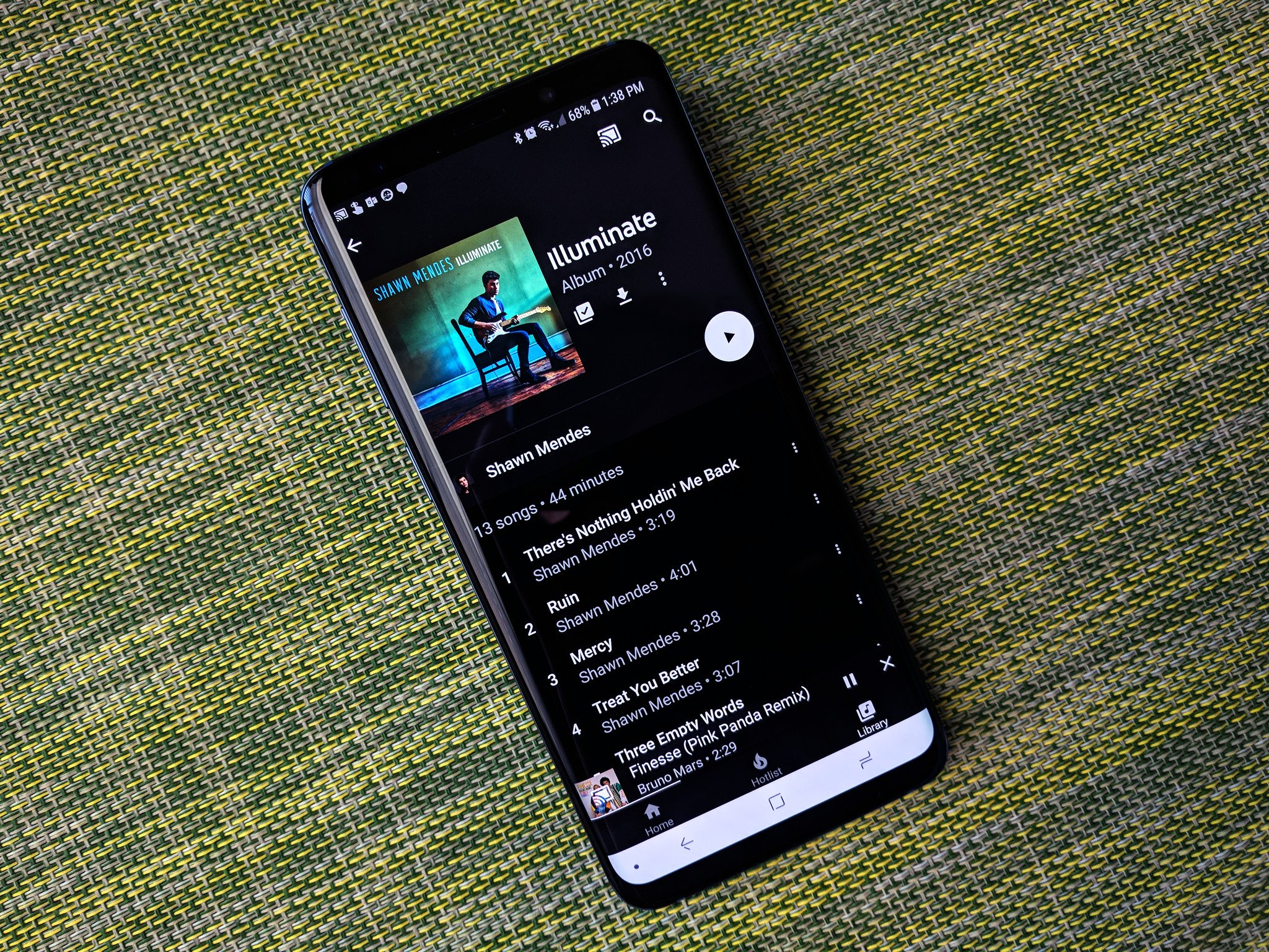
YouTube Music sports a dark theme on both its swanky new website and revamped Android app. YouTube Gaming's Android app has a dark theme, too. YouTube on Android TV even sports a dark theme — and a high-contrast black theme too. So what in the name of Material Design is holding up dark theme for the main YouTube app on Android?
If the style and behavior of YouTube's dark theme were still being worked out, I could understand the delay, but they're already out and stable on iOS and YouTube.com. If YouTube looked different on every different skin of Android the way the core Android system did, it might take more time to nail the Dark theme down.
But it doesn't. In fact, the dark theme is sitting deep in the code for the YouTube app installed on your Android phone right now, and we know it works because root users have been able to turn it on for over four months.
So, really, why hasn't it been officially pushed out to Android users yet?
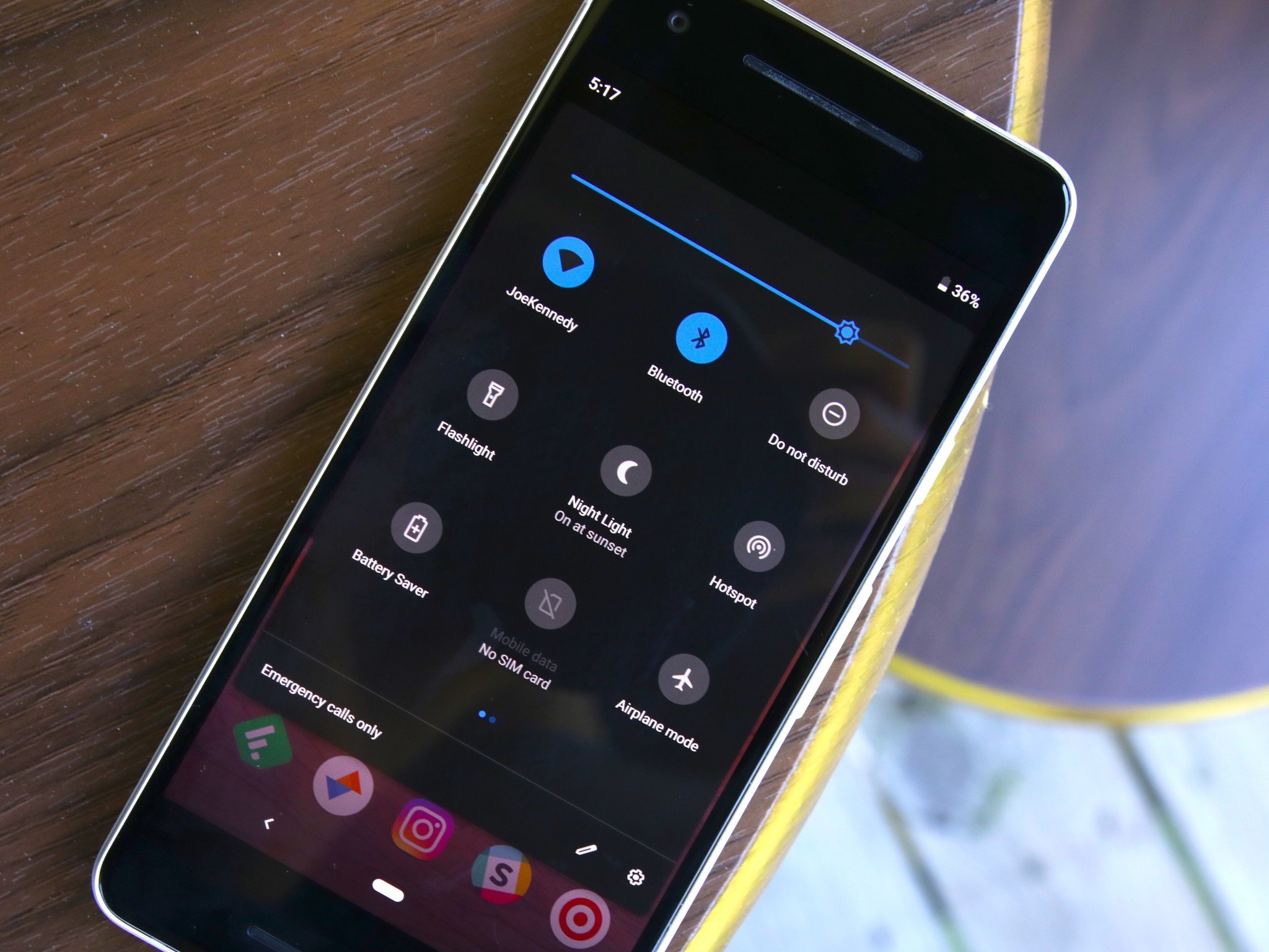
Google has toyed with us creatures of the night for years when it comes to dark themes on Android. System dark themes have been teased in Android Developer Previews for years, only to be snatched away before the final release. Many thought Android P would finally break the spell, but it only themes the Quick Settings and some system popups.
Read more: the case for Material Dark
The benefits of a dark theme on YouTube are easy to find and easy to notice: vivid video thumbnails pop against a darker background, which is also less distracting to the user while they watch a video. Dark theme makes the whole app easier on the eyes when we're watching Google Assistant whup Siri six ways to Sunday instead of getting our much-needed sleep.
That's why dark themes are available for YouTube on iOS and web. So what's the holdup on finishing it out on Android? Who at YouTube do we need to beg, barter, or bribe? I'm not above begging for a dark theme on any Google app right now, especially one I tend to use at late hours in dark bedrooms. Anyone else care to join me in begging for Android users to get what everyone else has already had for months?
from Android Central - Android Forums, News, Reviews, Help and Android Wallpapers https://ift.tt/2LgTzcy
via IFTTT


No comments:
Post a Comment